Tactile Thinking
Rediscovering typewriters has made me aware of how the tactile experience shapes thinking. What role might tactility play in the future of CAD?
For as long as I can remember, I’ve been fascinated with machines and how they work. I grew up with the soundtrack of my Dad’s Smith-Corona typewriter hammering away like a machine gun. I’d play with his typewriter when he wasn’t using it. Over the past few years, I rediscovered typewriters and have found them to be useful and interesting in ways I hadn’t quite anticipated.
I’ve discovered that I’m most interested in standard-sized office typewriters from roughly 1960-1984. These feel more like tools and less like antiques, and their industrial design is modernist and beautiful. They’re every bit as designed as a device made today by Apple, with the added benefit of being completely serviceable. It’s extraordinary that these 60 year-old machines can be brought back to life with some solvents, fresh oil and new rubber.
Typewriters from this period are the culmination of a century of continuous development in mechanical engineering and ergonomics. They also reflect an intense period of technological change. They feel like the last great effort from amazingly skilled people who were trying their hardest to hang on to what they had built.
Another reason I chose typewriters from this period is because I wanted to use them to help me think through ideas I’ve been wrestling with. “Modern” typewriters offer the kinds of creature comforts that help the typewriter disappear while writing.
Now that I’ve had the privilege of getting to know typewriters better (and in a way that likely wasn’t affordable when typewriters were new) I’ve been surprised to discover that differences in the design, feel, and sound of each typewriter impacts how I think, sometimes significantly.
Here are a few of my favorites:
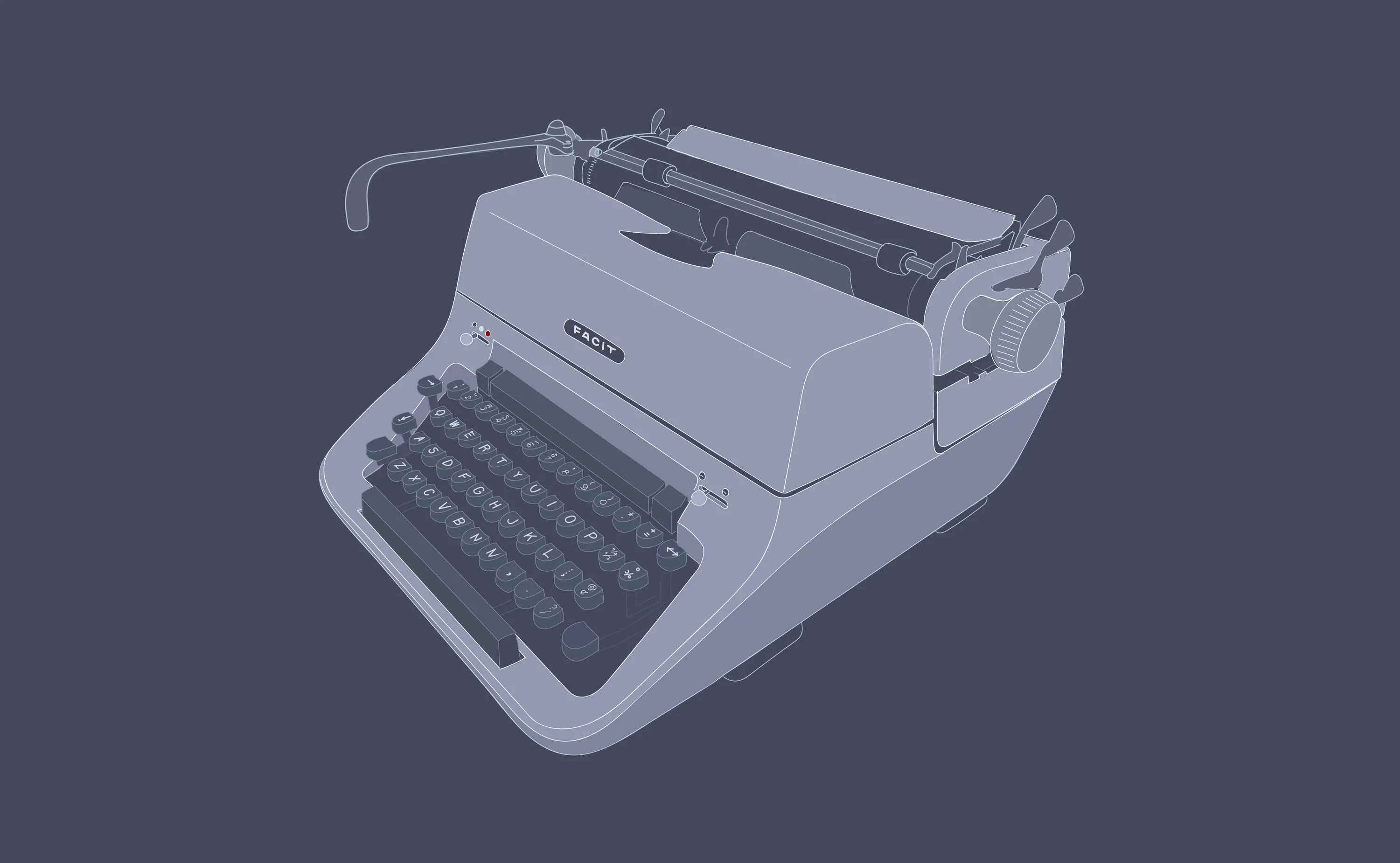
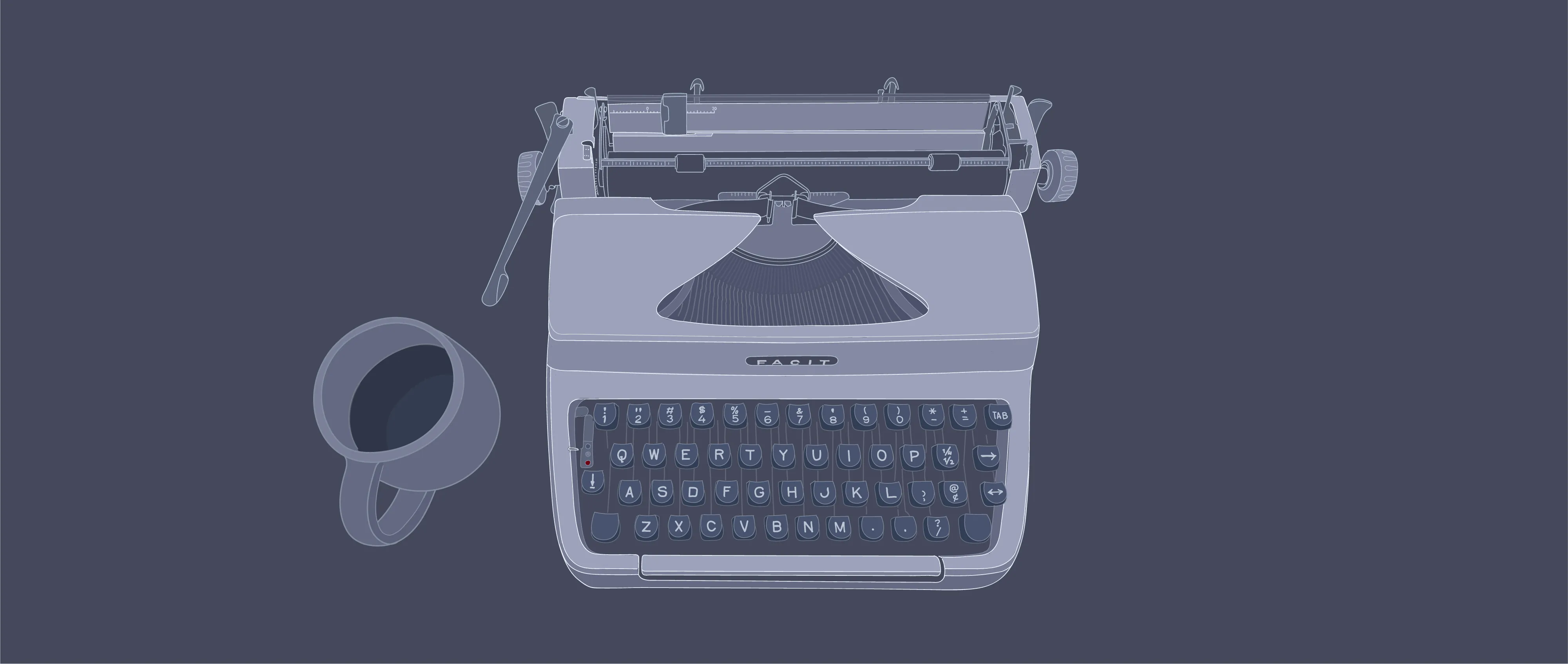
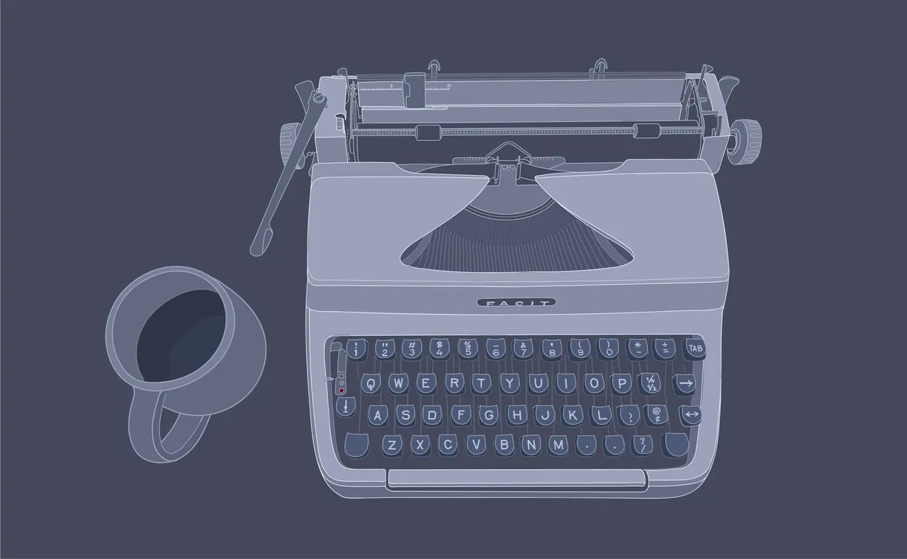
Facit T2 (1963)
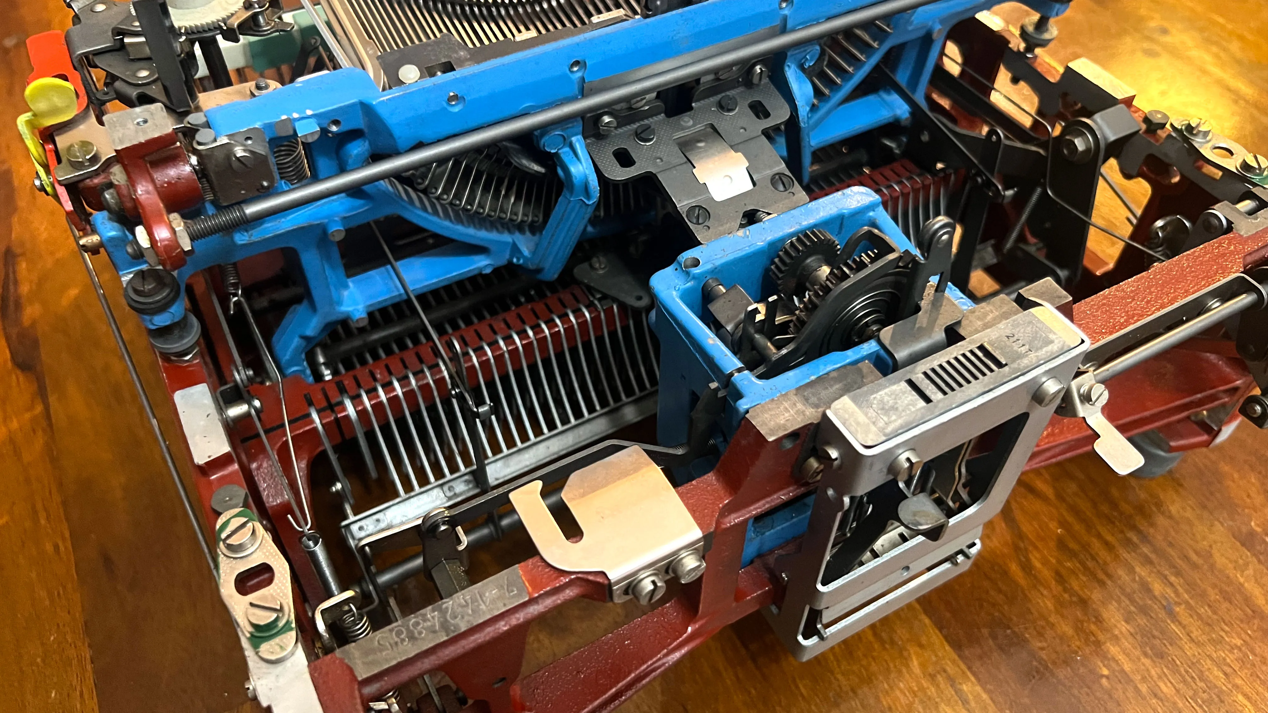
The Swedish Facit T2 is a manual office typewriter designed by prominent mid-century industrial designer Sigvard Bernadotte. It was for sale on eBay for $200 with original cover and manual. This typewriter features a 11” platen, which was the narrowest configuration, and the font is 12 character per inch Elite. I took the typewriter in for servicing and new platen rubber at Berkeley Typewriter.
The design of this typewriter is modern and lovely from almost every angle. It must have looked like a spaceship when the design was launched in 1958. I think the design holds up well even today.
Out of all the typewriters I own, this one feels most like a precision instrument. It sounds the best, owing to a very thick cast aluminum frame and shell. The shift keys index at the bottom and top of their stroke. Type strikes are muted when they hit the page, and the 12-CPI font lends itself to thinking with fewer interruptions before having to use the carriage return lever. The controls for setting the firmness of the touch control and ribbon color are delightful to use, clicking from one indexed detent to the next. When the margin release key is pressed as you’re nearing the end of a line of text, the key stays down until you return the carriage back to its starting position. The curvature of the carriage return lever feels very nice in the hand, as do the carriage release levers near the platen knobs.
This typewriter requires firm typing — the amount of force required to depress a key is more than average, but this results in a better impression on the page. The keys and spacebar feel a bit sharp under my fingers, which usually means that after 2-3 pages of typing, I’m ready to take a break.
This typewriter is the one I use most frequently because of how precise and mechanical it feels and sounds. It asks me to be crisp in my thinking. This is a good typewriter for thinking through whatever is top of mind at the start of the day. Under-carriage beverage clearance is tall enough fit a coffee cup with room to spare.
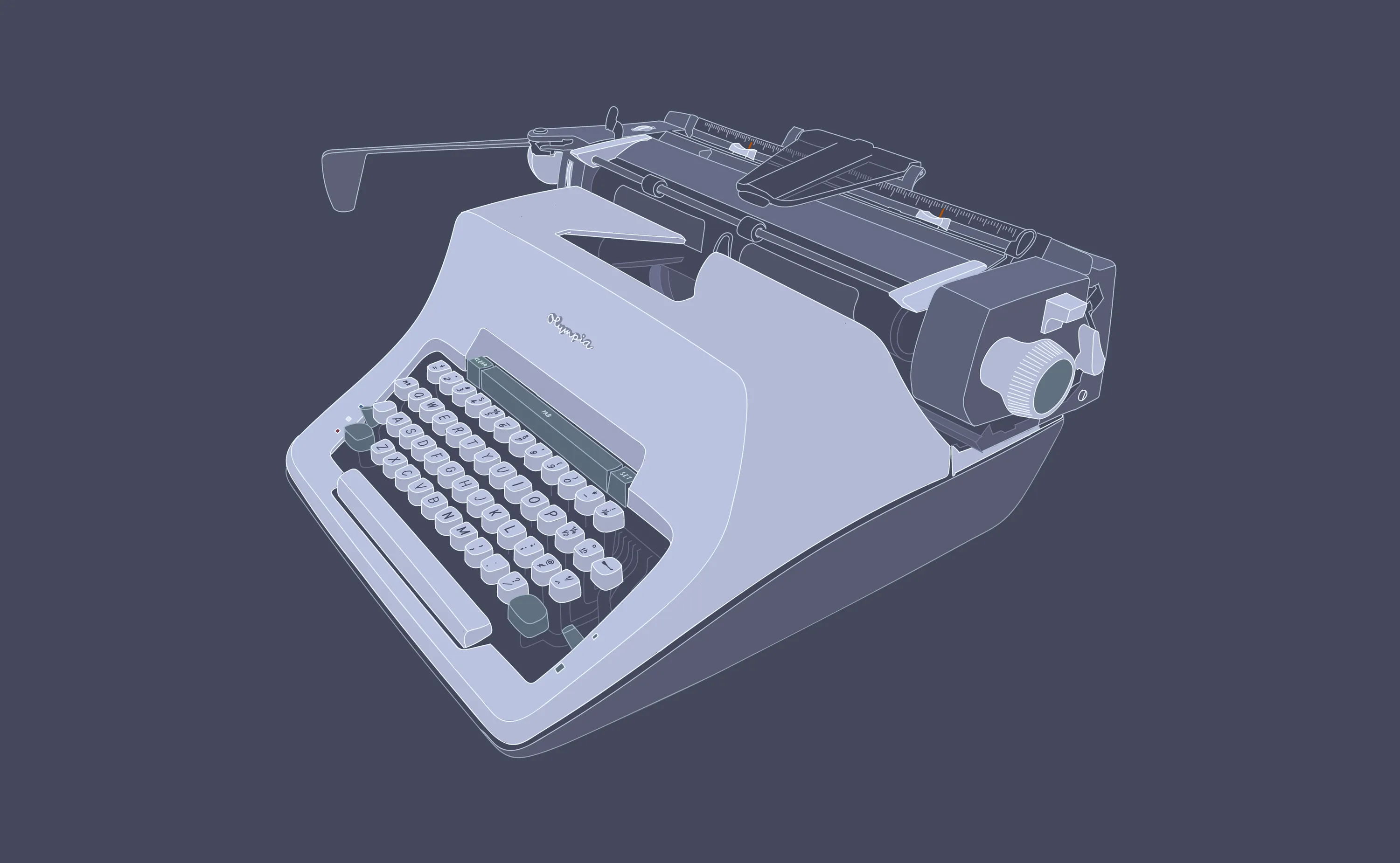
Olympia SG3 (1965)
This typewriter was designed and manufactured by West German company Olympia-Werke. I found it for sale for $92 with the original cover for pickup within an hour and a half drive from home. This typewriter featires a 12” platen — the narrowest configuration available and has all the plastic bits that are typically missing from this model. Font is a 12 CPI Elite font. The typewriter was in amazing shape when I picked it up. I gave it a good cleaning and then took it into Berkeley Typewriter for servicing and a recovered platen.
This typewriter is exceptionally well-engineered and it’s designed to be easy to service. Pull the cover off, flip two levers, unscrew four screws, and the entire mechanism is ready for cleaning and servicing. The most impressive part is how Olympia took the care to color code the internals to make it easier for a technician to service.
The thoughtfulness in design also extends to the bottom of the typewriter as there are two well-placed handholds on the bottom - which is a good thing since this typewriter weighs close to 38 lbs..
From an industrial design perspective, I sense the designers were going for something that would fade into the background after a short while. Out of all the manual typewriters I own, this one feels the most like an appliance. The bulk of the internals are sealed to keep dust out and this streamlines the design. There’s not a great deal of personality here, but that’s kind of the point.
I find the keys considerably easier to press on the Olympia compared to the Facit, it seems to be more forgiving or poor typing technique, and the type impression is the most consistent of all the mechanical typewriters I own. Keys feel nice and the rounding on the front of the spacbar is lovely to touch. This typewriter is very fast, and I find that I can’t outtype it. It doesn’t sound as pleasing as the Facit — there’s a slight tinny noise coming from the ribbon vibrator hitting its stop as the type slugs return their resting position.
When I’m working on longer-form writing, this is the typewriter I want to use. It seems to be the one where flow comes easiest. Under-carriage beverage clearance is better than the Facit — just shy of a pint glass.
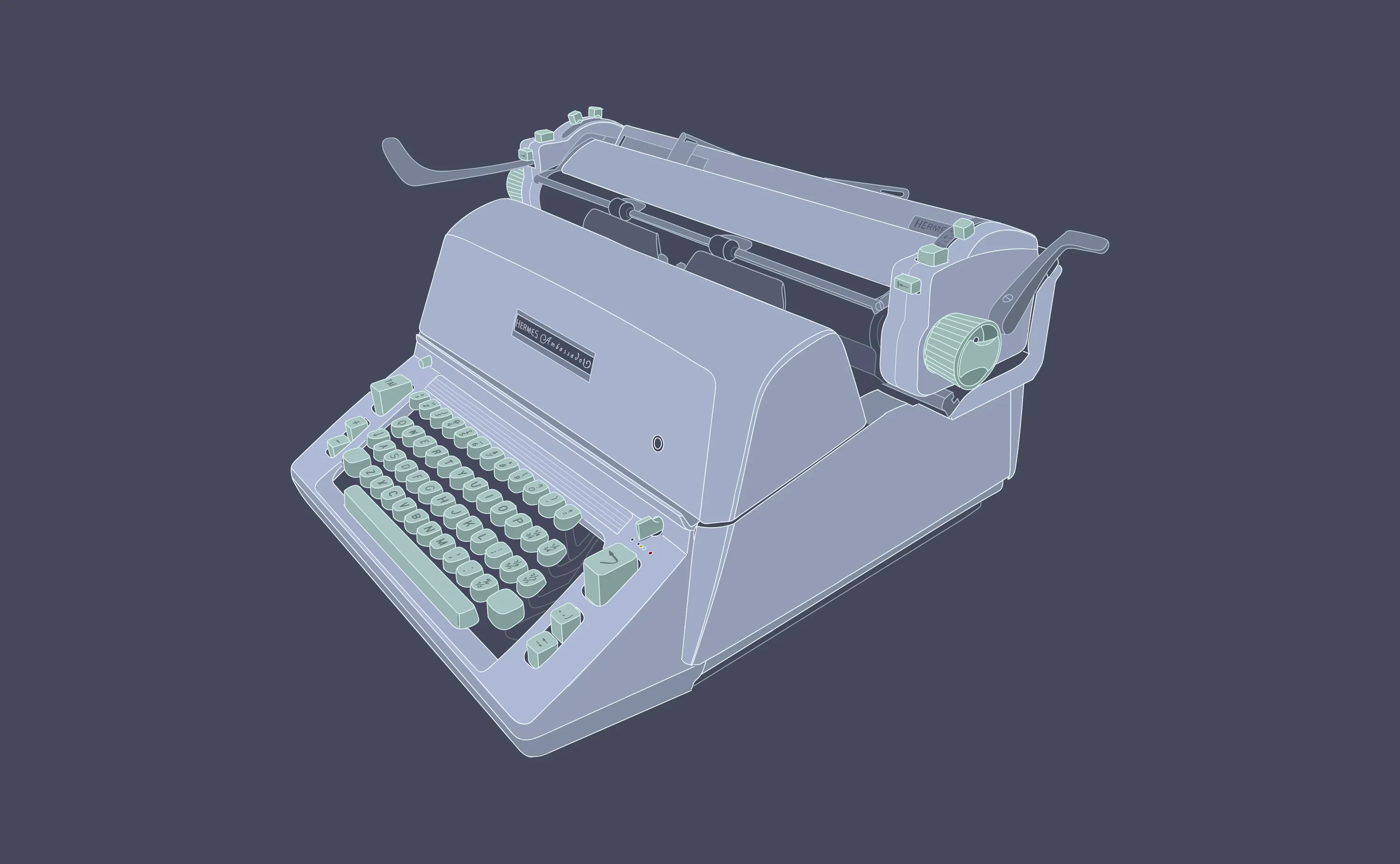
Hermes Ambassador B1-C (1966)
The Swiss-made Hermes Ambassador was manufactured by Paillard S.A. and designed by Giuseppe Prezioso. I took a $300 gamble and had it shipped from the UK. Thankfully it was very well-packed and arrived almost unscathed. A visit to the spa at Berkeley Typewriter for some fresh rubber, the last of their new old stock card guides, and couple of replacement buttons and it was back to original condition. It features a 15” carriage and a 10-CPI Petit Pica font, and has the original dust cover.
This is far and away my largest typewriter and it feels like a piece of industrial equipment. When the surprisingly short carriage return lever is pulled, the carriage sounds like the side door of a delivery van before it closes. The industrial design is polarizing in the typewriter collector community, but I think it’s just on the right side of the beautiful/fugly line. It definitely feels of a specific time more so than the other typewriters described in this essay. It’s got a bit of 1960’s sci-fi swagger to it.
This typewriter is notable for its mechanical complications. It features two ribbon systems, one for fabric ribbon and one for carbon ribbon. It has two margin release buttons. One will give you an extra 5 characters, and one that will allow you to type as far as your paper will allow. It has a giant paper guide which helps to position the typed page at just the right angle for viewing, and best of all, it has a paper injector lever that will quickly inject a peice of paper so that it’s ready for typing at just the right starting place.
The Hermes Ambassador takes a very different approach to ergonomics than the other typewriters. The keys for interacting with the carriage — tab, tab set, backspace, margin release — are separated from the character keys. Creating different zones feels like a very modern approach to user interface design. Key carriage controls are activated through buttons rather than levers, as was common for typewriters. The color of the typewriter and keys which were chosen to create a visually calming typing experience.
The inner workings of the typewriter are completely hidden from view and the experience of typing is one where the letters just appear on the page. Since jamming keys is always a possibility, the Hermes Ambassador also includes a key unjammer button you can press.
The shape of the keys is the best of all the typewriters I own — they’re rounded and smooth, and this contributes to the satisfaction of interacting with this typewriter. I do find that the Ambassador seems to prefer a deliberate typing style, but the force required to press the keys is lower than you would think. Generally my typing is a bit more measured on this typewriter. The spacebar action is clear but on the softer side accompanied by a muted ker-chunk. Typing is quite loud and sharp, owing to the size of the case and large platen diameter.
When there’s something I want to think through and I know the going will be slow and halting, this is the typewriter I choose. There’s something about it that makes me approach a hard problem by thinking around it until the shape becomes clear. Under-carriage to beverage clearance is best-in-class among manual typewriters. A pint glass will fit under the carriage with room to spare.
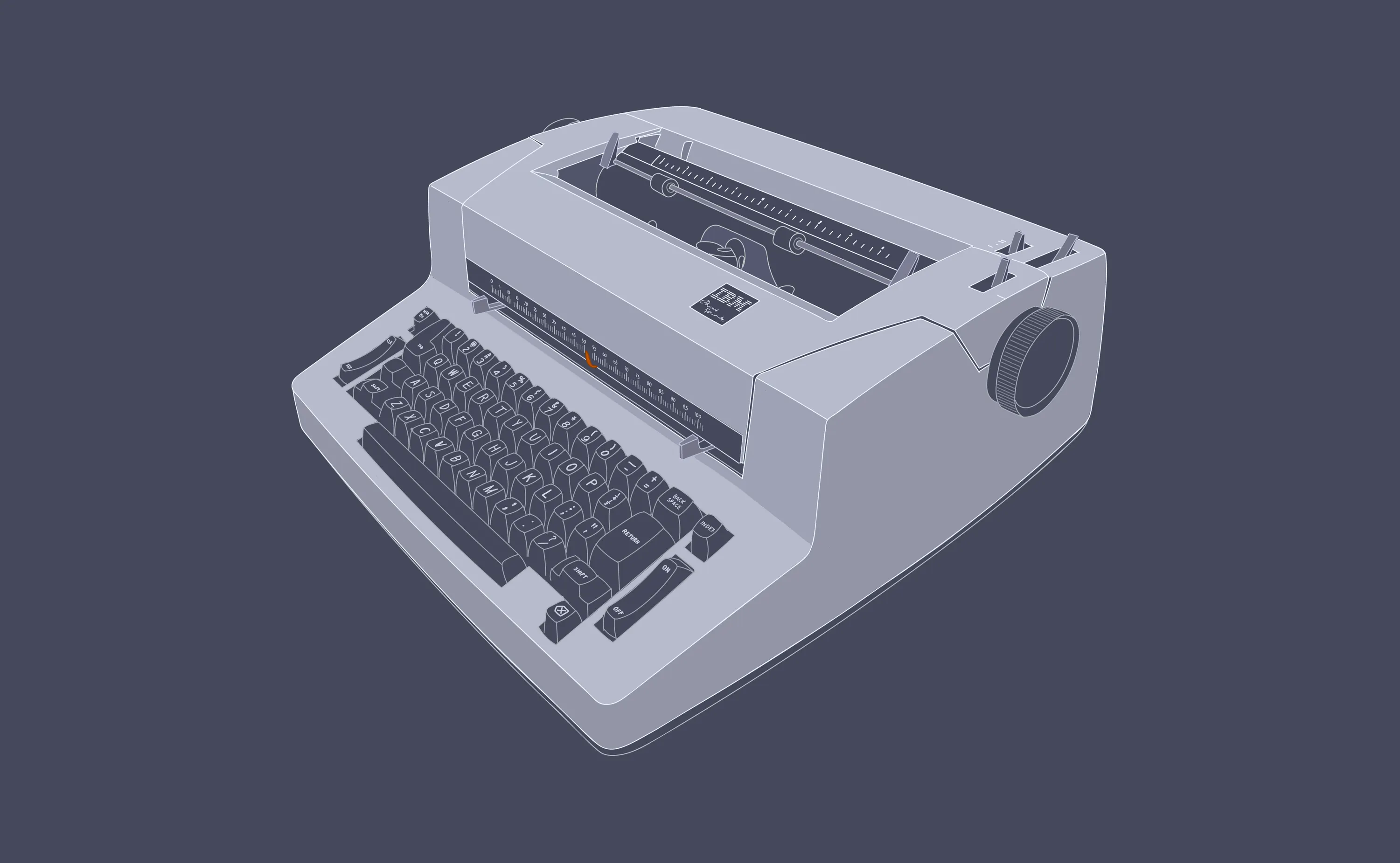
IBM Personal Typewriter (1983)
I found this IBM Selectric Personal Typewriter for $40 at an estate sale listed on Craigslist. I had been on the hunt for one of these for a few years and I was able to spot it in a blurry photo. It was designed by Eliot Noyes and was only manufactured in 1983. The general consensus from the typewriter enthusiast community is that these were created to use up IBM’s stockpile of parts from all three generations of IBM Selectric typewriters. This model was notable for offering an 11” platen and came with a denim carrying bag for anyone that wanted to lug around all 35 lbs. of typewriter.
The IBM Selectric was an engineering tour de force with over 2,800 parts and it was a massive success, claiming 94% of the electric typewriter market in 1978.
The IBM Selectric re-wrote many of the rules that had governed typwriters for the better part of a century. Instead of employing a system of typebars attached to keys via linkages, the Selectric employed an interchangable golfball-sized type element that would be rotated in two planes at a high rate of speed. Instead of just featuring one font, the golfball could easily be switched out for another, allowing the typed page to be more expressive.
Instead of the carriage moving from side to side as the page was written, the Selectric type element would move from side to side while the the platen remained stationary. Where a regular typewriter would use a fabric ribbon impregnated with an oil-based ink, the selectric utilized cartridges with single-use carbon ribbon for a sharper imprint and the ability to erase the type. While a regular typewriter was very unforgiving where typos were concerned, the selectric employed a second ribbon system that utilized a sticky tape which could lift a letter off the page.
Here’s a great explanation of how the Selectric works:
While my selectric was cosmetically in great shape, it needed to be resuscitated. After many years of sitting on a shelf, this machine had frozen up solid. So off to Berkeley Typewriter for an extended stay where my $40 bargain cost me over an an order of magnitude more.
I find the Selectric’s industrual design quite beautiful in a restrained way. At first glance, it seems very square and boxy, but a detailed inspection reveals subtle curves. It’s a high point of 1970’s modernist office equipment design. I prefer the proportions and scale of this model over the larger office models. It really does feel more intimate and personal.
The typing experience is more computer-like than typewriter-like. The keys have about half the travel of a manual typewriter, and the actuation force is much lighter. It’s impossible to type faster than the typewriter and it never jams. The ability to erase a character changes the typing experience entirely.
When there’s an idea I want to jot down as quickly as possible or when I’m writing correspondence, this is the typewriter I choose. This typewriter can move at the speed of thought while also offering forgiveness with typos. Beverage clearance of the Selectric is essentially infinite since there’s no moving carriage — definitely a bonus.
There are significant benefits to unplugging, sitting in front of a typewriter, and putting your thoughts on paper. Words created through pressing on typewriter keys have a different weight. A line means something more when you have to actuate the carriage return lever. You feel the bottom of the page approaching far more keenly on a typewriter than a word processor. Your thoughts become tangible when the pages stack up. In a world full of distractions, this kind of engagement feels useful and necessary.
As AI becomes more able to understand and use fuzzy inputs, I wonder whether there might be the possibility of reintroducing analog tools that can encourage us to be more thoughtful and present. This is already possible with the typewritten page. Optical character recognition on phones makes it trivial to convert the typed page into live text. The shortcomings of working on paper in a digital world are beginning to recede.
Could there be other opportunities to build mechanical analog devices that augment people the way that typewriters can? Could there be a class of analog devices that are mechanically engaging that could enable people to think through design problems? Could there be a resurgence in making human-compatible analog tools for thinking?
For example, the drawing instruments in this Adam Savage video look like they would be amazing for thinking about ellipses:
Imagine if an architect or mechanical designer had a studio filled with these kinds of heirloom-quality tools. How would they feel while they were exploring new ideas? What would they be inspired to design using such implements? What would their design studios look like after a long career of acquiring and using analog tools to help them think?
Perhaps we’ll eventually see drafting machines come back into vogue. As computers get more capable, it seems reasonable to think they’ll be able to understand design drawings created by hand and convert them into editable CAD-native digital objects.
One day in the future, it might be possible for architects, engineers, and mechanical designers to do the bulk of their conceptual design work on paper and have AI do the digitizing. I love the idea that the next phase of CAD might be defined by computers learning how to adapt to the way that designers think and design, rather than the other way around.
More Reading
Future CAD Building Blocks
If we're going to evolve how we use computers to design and make complex things, we'll need to make sure we have the right building blocks in place.
APR 26, 2026